Kit comes first

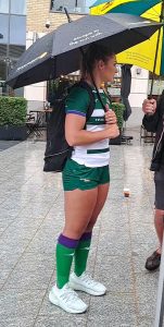
Amy Wilson-Hardy, Ealing Trailfinders (photo: Bruce Perkins)
Fighting for the lead in self-promotion, the ten clubs are offering three choices: signings and re-signings, the sufferings of pre-season training and the New Kit.
Let’s stick to kits for the moment.
They are being given more and more prominence, not least because they provide useful income for clubs. Supporters young and old now feel duty-bound to appear in variations of the colours. Those appearing in an outdated version won’t know where to hide.
New Kits to the fore
Exeter Chiefs: after having swcomms as their main shirt sponsors for 30(!) years, now switch to the Focus Group. The new shirts, in black and white alternates, were proudly presented on Exeter Cathedral Green.
Quins present their 2023-24 kit under the banner: Our Community, Our Homeland. Our Home Kit. That is to present ‘the Famous Quarters’, which have been only occasionally on view in recent seasons. Why clubs should label the alternative version as the ‘Away Kit’ is a sign of the times. The change used to e required only in case of a colour clash with the opposition. This year’s variation is essentiallly white. It goes under the equally sugary banner ‘Away from home, never alone’.
Some clubs are making less of a song and a dance about their kit.
Sale Sharks’ jersey looks to me a brighter blue than in the past – good. It is sponsored by BOL (Bring on Life), who cater for the healthier branch of the food world.
Overall colour scheme
Likes and dislikes: we all have our own. I’m not taken by variations of black, grey and dark blue, as sported by Bristol, Exeter, Sale, Saracens and Worcester. Can’t we have something a little brighter?
At the other extreme we have Loughborough Lightning in violet and pink. It took me a long time to realise it was violet, not purple. No mistaking them on the field, even if the latest kit presentation showed Rachel Malcolm in Northamptoon Saints colours. I’ll leave the two clubs to explain that conundrum.
The two newcomers introduce welcome shades of green.
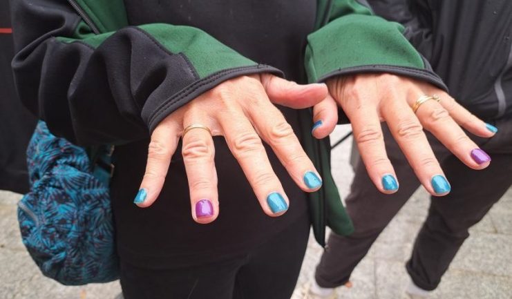
At Ealing Trailfinders’ recent Meet and Greet, the players appeared in the traditional green and white hoops, looking as though they had spent every day since last season in serious training. I made an early error by suggesting to Giselle Mather, the DoR, that her finger-nails had the wrong colour scheme: not green and white? I was put right on the spot: the correct colours are green and purple. Despite her eminence, she must admit that the purple is hard to spot against the traditional white hoops: the merest traces on stockings and sleeves.
Was it the strip that decided Kate Zackary on a change of club? Probably not, but you never know.
Leicester Tigers are another grand old club with familiar colours. Fortunately for the spectator’s eye, green predominates.
It’s amusing to read the manufacturers’ detailed description of their new kits: materials, styling, health-giving properties, the 10mph they add to every player’s speed over the ground.
Now we await the kit that the officials will be offered. How often will it clash disconcertingly with the colours of one of the teams competing? Will KYBO (Keep Your Boots On) be replaced by a version of PWR?


